

Responsive Web Design
We just don’t design, we design well. We design sites with creative strategy
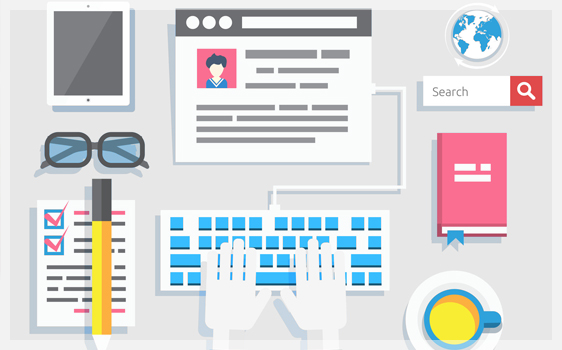
Your brand’s website is your face in the digital realm. It represents everything that your business signifies. Whether it is the first time visitors or consistent followers, a successful website has to leave an impression that visitors cherish. Responsive web design helps make a lasting impact on your visitors irrespective of the device they browse on.
A professional and appealing website design leads to higher customer retention rate and thus higher conversion as well. There’s no better way to look sharp than responsive.
Responsive web design means your website automatically adjusts to the device it is being viewed upon. So whether it is a phablet, tablet or a smartphone, your users will always get a browsing experience that leaves them spell bound. And with ever increasing mobile devices, you can always deliver a fluid user experience with zero future worries.
Responsive design goes beyond just user interface. It works at the core of online marketing strategy. So, you get a website that is better at eliciting positive response from the visitors. These websites are more likely to convert users into regular customers compared to drab traditional HTML websites.
More traffic
A non-functional website increases bounce rate. In comparison, responsive websites are more engaging and retain more traffic.
Customer Engagement
Easy navigation of a responsive website ensures that customer engagement is superior and they spend more quality time.
Better Rankings
Google recommends responsive design to give its users a good experience. No wonder that search engines give priority to responsive web design
Now is the Time to Choose Mobile Friendly Design
As the mobile devices continue to grow exponentially, more online businesses are realizing the need to go responsive. If not, they lose significant mobile traffic that could otherwise have powered the sales. At Crayons World Technologies, we specialize in creating custom-made responsive websites that enrich your website with personality irrespective of the device’s resolution.

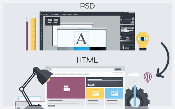
Design Strategy
Your brand’s website is designed right from the scratch with essential design elements as priority. So, you never get off the track in terms of appealing design aspects.

Local SEO
Our team of responsive web developers integrate responsive design with local SEO to give you an upper hand in SERPs and contribute to more sales.

Conversion Oriented
What’s good design and development that doesn’t convert? We create elements and styles that lead to more sales – whether on mobile or desktop.

Fluidic Design
Responsive websites are more fluidic and better arranged in grid elements. Also, we use the latest in responsive HTML5 to give your users a cutting-edge experience.

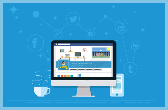
Social Media Integration
Responsive design in combination with social media platforms is great way to engage your customers. We encourage social sharing on top social networks.

No Compromise Resizing
Forget pixel defects and image hangovers. We create responsive websites and follow with in-depth testing to ensure it shines on every device.